
CLIENT
SMEG
SERVICES
UX/UI Design, Interaction Design, UX Researcher, Digital Product Design
PLATFORM
Android & iOS
TIMELINE & STATUS
June 2024 - January 2025
Overview
SMEG Connect + is the app that allows users to connect and manage SMEG appliances directly from their mobile devices.
It serves as the brand’s primary digital touchpoint, extending the physical product experience into a connected ecosystem.
My Role - Product & UX/UI Designer
The main goal was to deliver a fully documented Figma file with clear specifications that could be implemented immediately by the development team.
I independently led the UX/UI redesign from initial analysis and research through information architecture, user journeys, wireframes, visual design, prototyping and Design System creation, working closely with the client throughout the project.
The Challenge
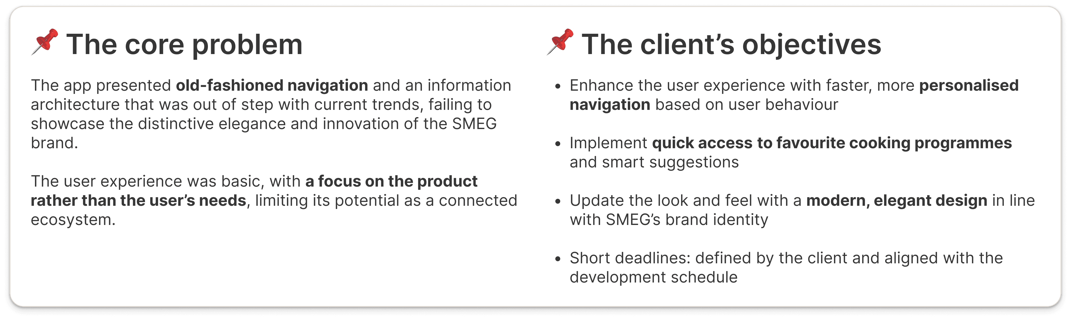
The existing SMEG Connect app had lost sight of user needs:
"The app feels a bit outdated and works more like a remote control than an assistant" - User feedback from internal testing
The client wanted to:
🔴 Simplify navigation and reduce the number of interactions
🔴 Personalize the experience based on connected appliances
🔴 Introduce faster access to frequently used features
🔴 Modernize the interface while staying consistent with SMEG's visual identity
🔴 Deliver all design specifications within a very tight development schedule
Approach
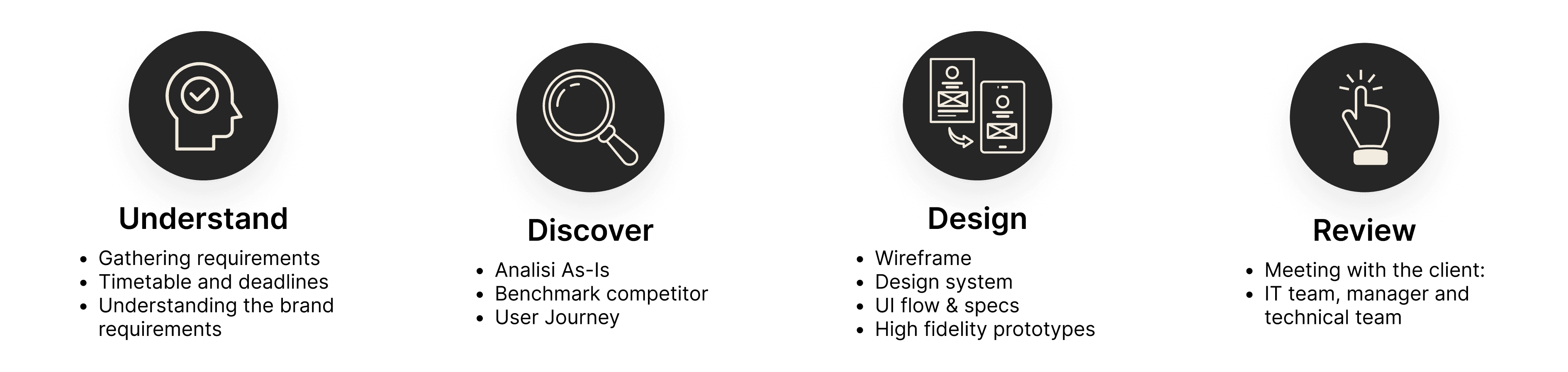
As a Product Designer, I managed every stage of the design process, working collaboratively with the client and holding weekly meetings to share progress and discuss the next steps.
1️⃣ Phase: Planning and timelines
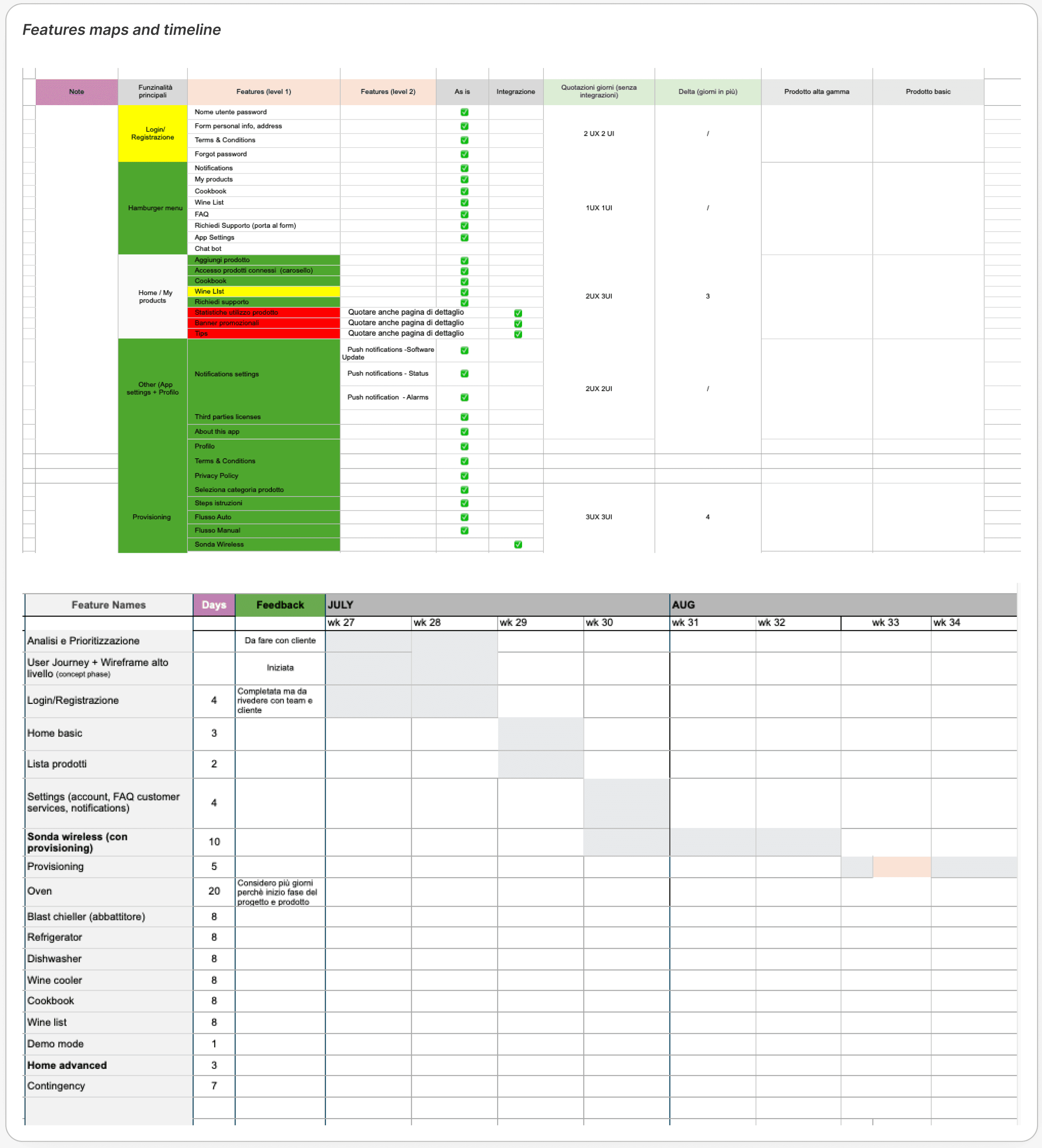
During the early stages of the project, I created a table listing all the features (as-is and additional ones), assigning the required effort in days.
Once the timeline had been established, I shared the schedule with the client and agreed on weekly meetings to monitor progress. The client involved the necessary stakeholders to review and validate the workflows.
Conducted comprehensive UX/UI inspection of existing SMEG Connect app
Mapped 50+ specific usability issues across all product categories (ovens, wine coolers, dishwashers)
Analyzed user flows identifying navigation inconsistencies and interaction friction points
Documented technical limitations and implementation gaps
2️⃣ Phase: Analysis and research
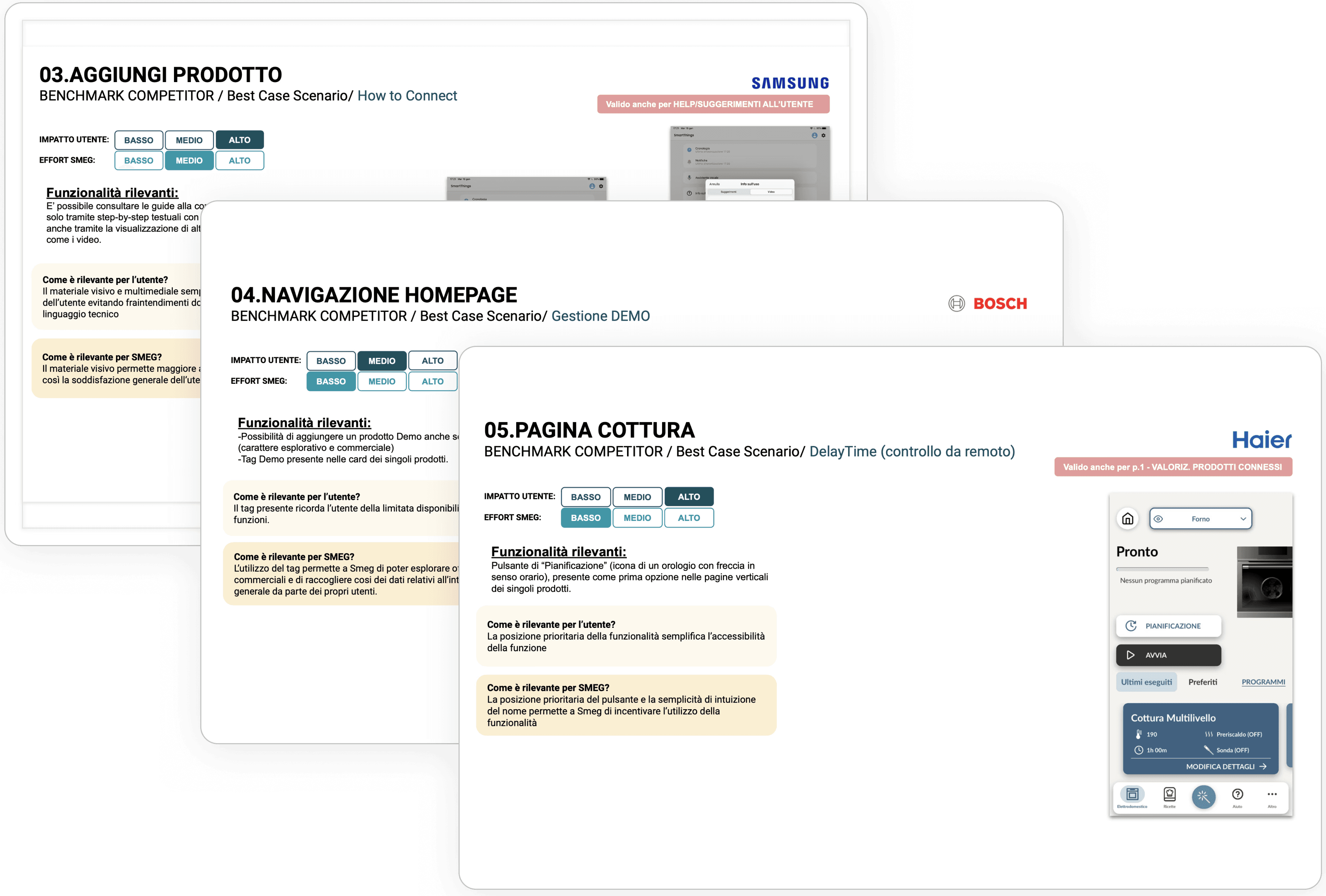
I have selected several competitors in the home appliances sector (Whirlpool, Miele, Bosch, Haier, LG, Samsung), focusing on the key features:
Adding a product and onboarding
Selecting a cooking cycle
Viewing the product in use
Home page layout
Product care and maintenance
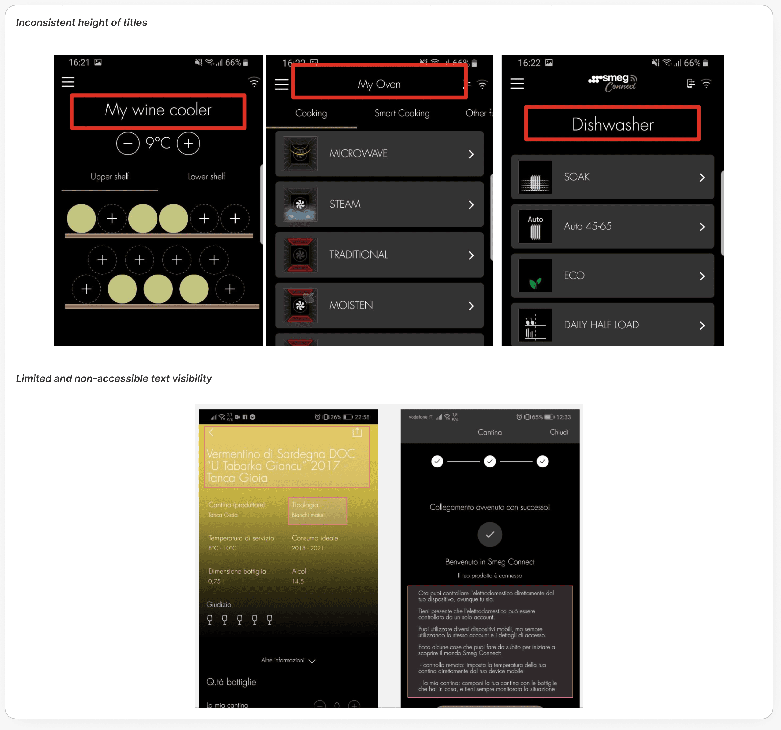
UX Audit & Pain Points
I conducted a complete UX audit of the app as it currently stands, highlighting the following areas for improvement:

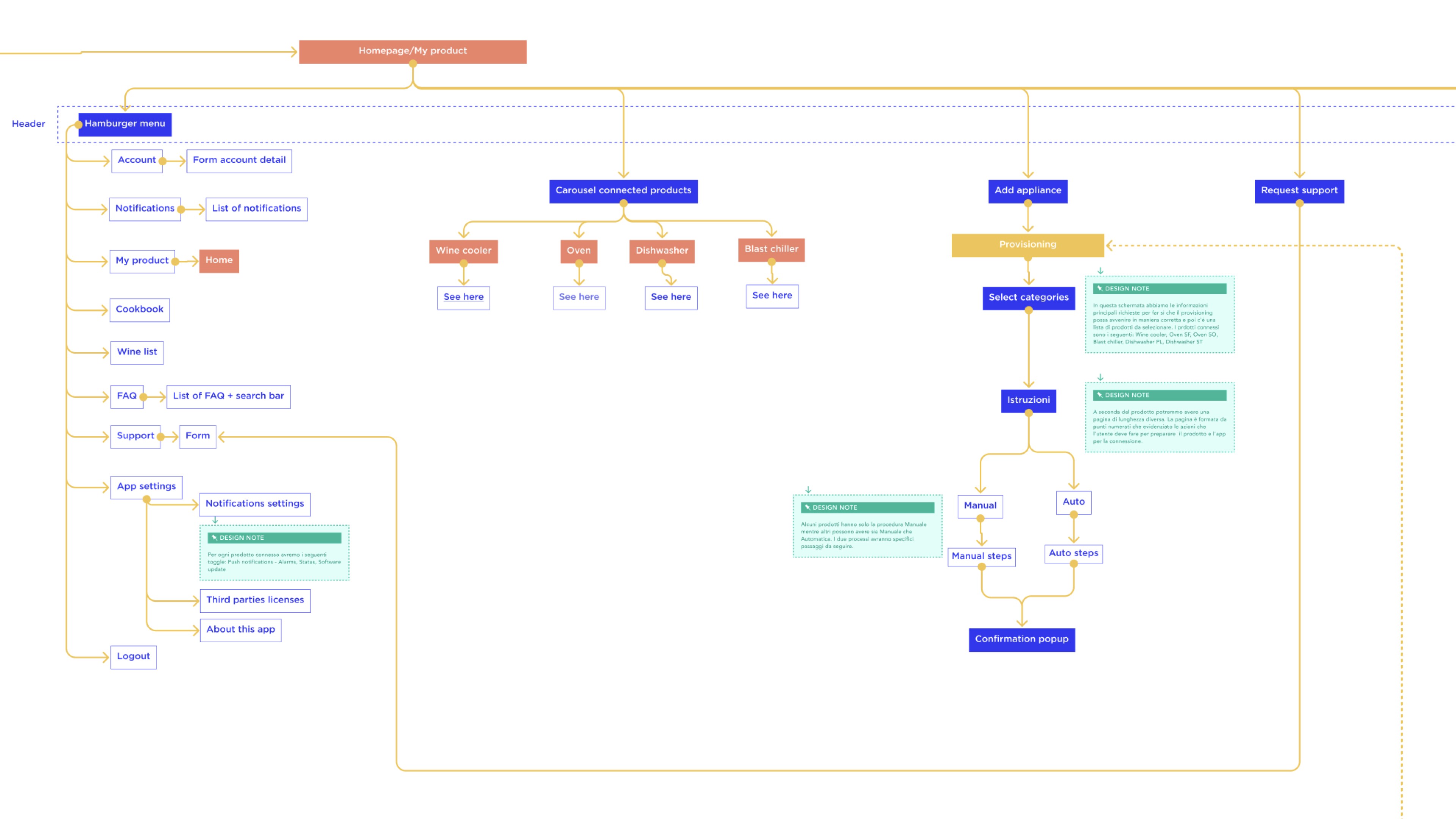
Information Architecture & User Journey Mapping
Once I identified the main pain points, I mapped the user journey to better understand user goals, key interactions, and opportunities for improvement across both everyday usage and the end-to-end experience. Based on these insights, I completely restructured the information architecture around a few core principles:
User-first, not product-first: organize the experience around user tasks rather than appliance categories.
Reduce complexity: remove unnecessary steps and simplify navigation.
Personalization: adapt content and features based on the user's connected appliances.
Quick access: ensure the most frequently used actions are always reachable within two taps from the Home screen.
3️⃣ Phase: from wireframe to final solution
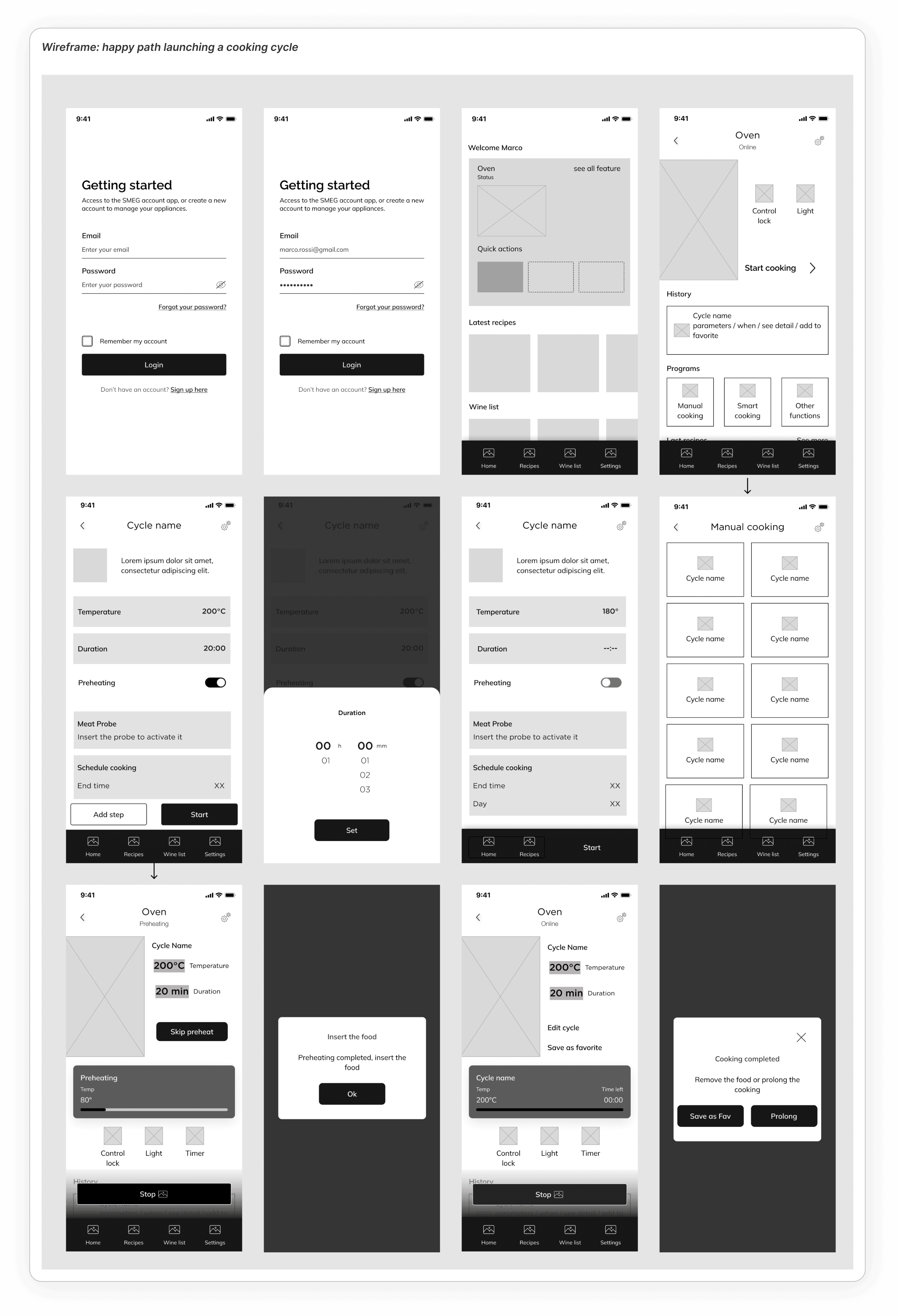
Once the objectives had been defined and the critical points identified, I began to translate the strategy into a concrete design, starting with the high-impact screens: the Home page, the product detail page and the settings page.
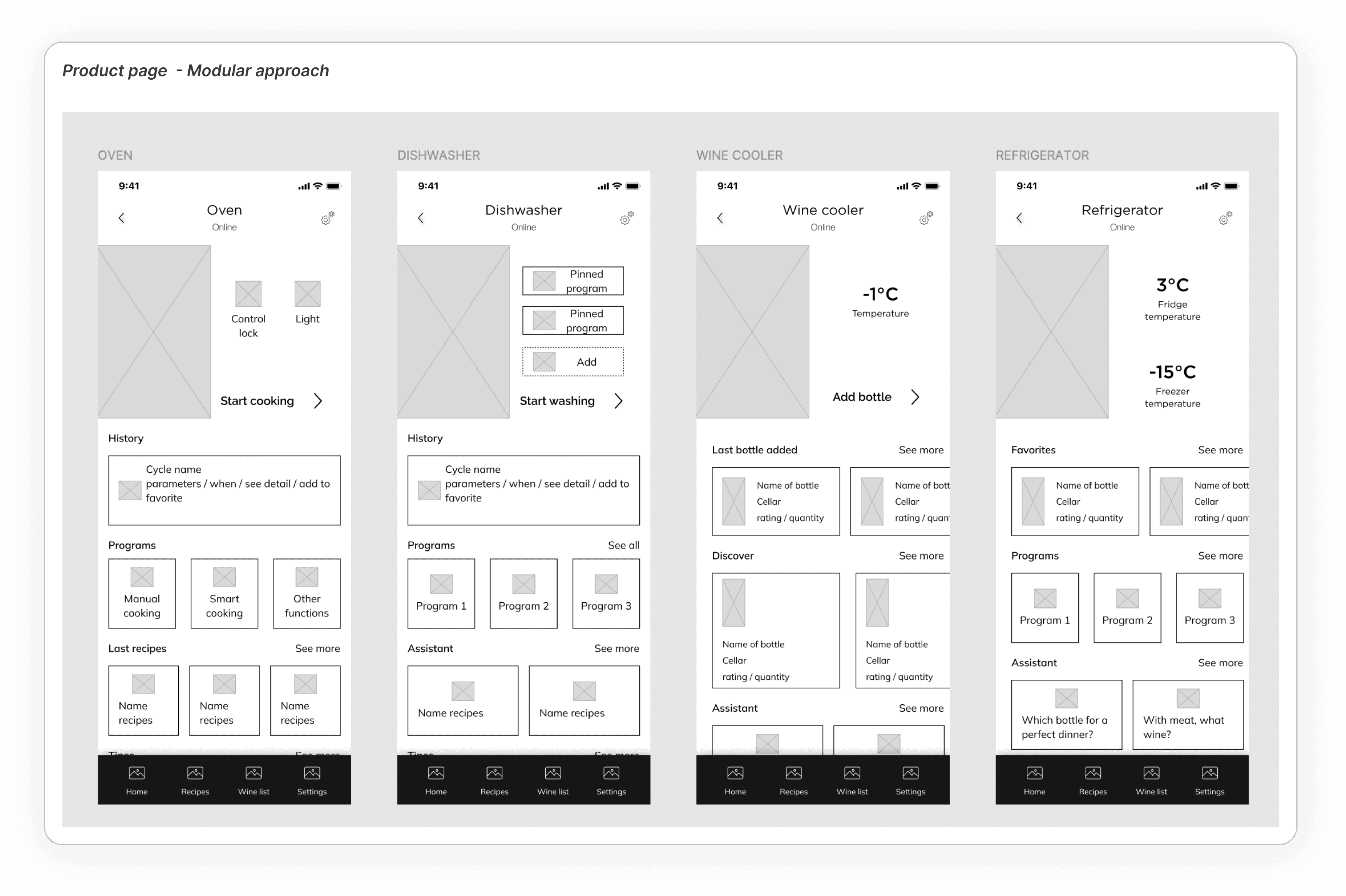
One of the most interesting challenges was to design a modular product page that would work for every SMEG household appliance (ovens, dishwashers, fridges, wine coolers).
I mapped out all the products, identifying:
• Common states (programming, in use, end of cycle)
• Recurring components (progress bar, controls, timer)
• Variations required for each category
Design System creation
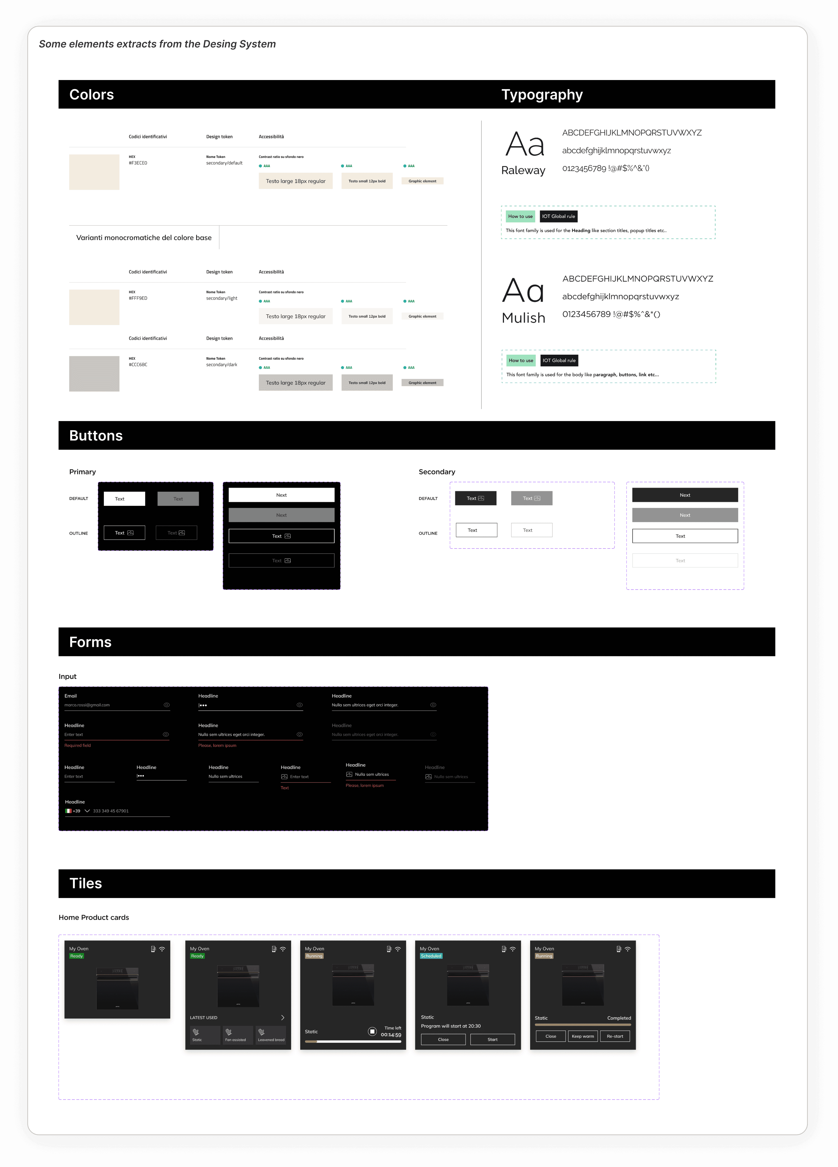
The brand’s goal was to create a digital identity consistent with the new direction of the SMEG website, in order to build a cohesive visual ecosystem across all channels, from e-commerce to the app, and from communications to product pages.
What I built:
• Design tokens, basic and complex components
• Navigation patterns and states
• Development documentation
The Design System has become a shared language between the design, development and brand teams.
From UX to UI: bringing workflows to life
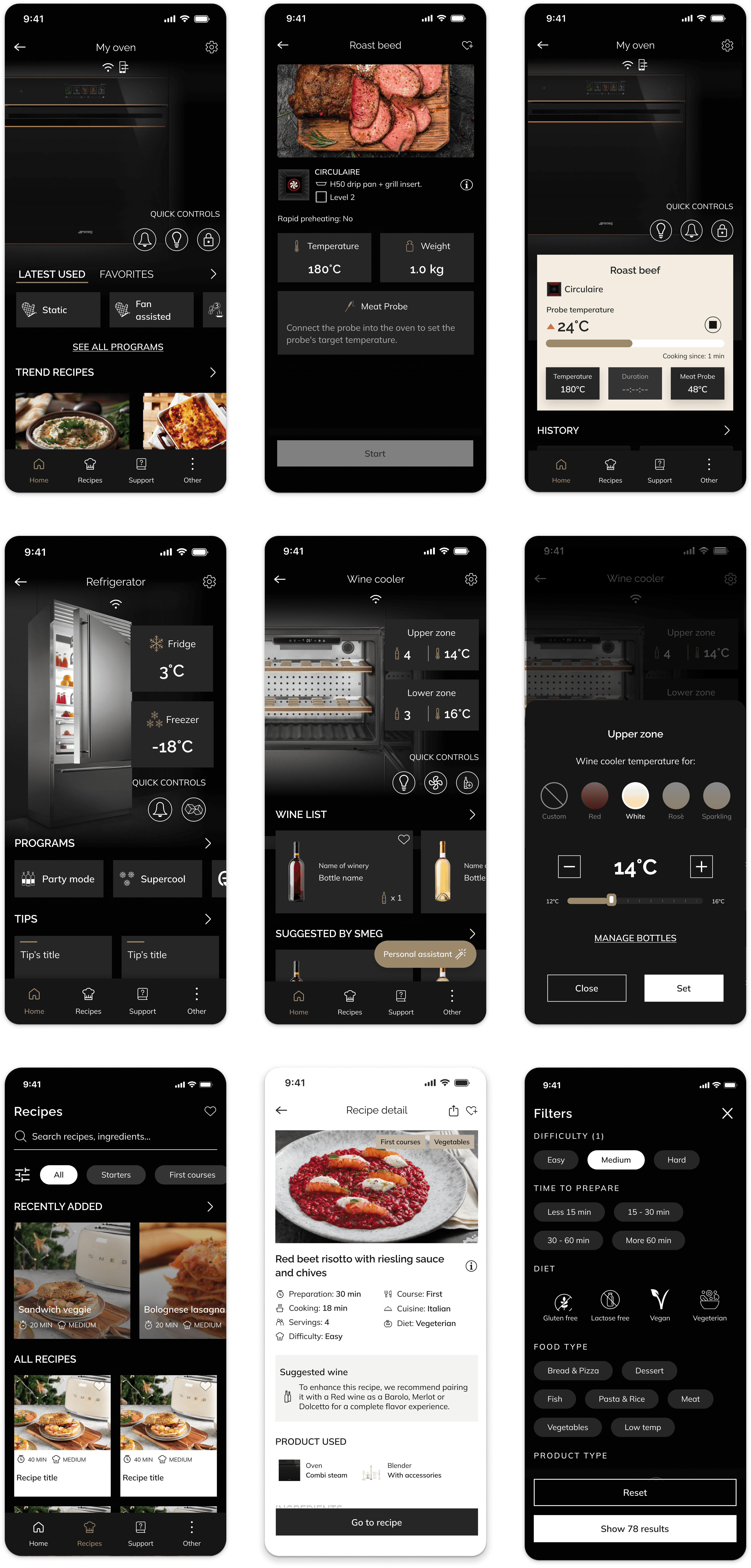
With the Design System in place and the UX workflows validated, I began translating the wireframes into final interfaces. It wasn’t simply a matter of ‘dressing up’ the wireframes with the design system, each screen required careful decisions regarding visual hierarchy, interactions, states and transitions.
Outcome
The redesign transformed SMEG Connect from a product-focused remote control into a more cohesive and user-centered digital experience.
The new information architecture simplified navigation, while the modular design approach allowed the experience to adapt across different appliance categories. The new Design System also created a shared foundation for future product and feature development.
DOWNLOAD THE APP